Friday, 22 November 2013

Error analysis is the sweet spot for improvement

Although Don Norman was discussing designers attitude to user errors I assert the same is true for programmers when we use static program analysis tools.

The errors, or rather defects in the jargon, that a static analysis tools produce can be considered low cost well formed bug reports available very early in the development process.

When I say low cost it is because they can be found by a machine without a user or fellow developer wasting their time finding them. Well formed comes because the machine can describe exactly how it came to the logical deduction leading to the defect.

Introduction

Static analysis is in general terms using the computer to examine a program for logic errors beyond those of pure syntax before it is executed. Examining a running program for defects is known as dynamic program analysis and while a powerful tool in its own right is not the topic of discussion.

This analysis has historically been confined to compiled languages as their compilers already had the Abstract Syntax Tree (AST) of the code available for analysis. As an example the C language (released in 1972) had the lint tool (released in 1979) based on the PCC compiler.

Practical early compilers (I am generalising here as the 19070s were a time of white hot innovation in computing and examples of just about any innovation in the field could probably be found) were pretty primitive and produced executables which were less good than hand written assembler output. Due to practical constraints the progress of optimising compilers was not as rapid as might be desired so static analysis was largely used as an external process.

Before progressing I ought to explain why I just mixed the concept of an optimising compiler and static analysis. The act of optimisation within those compilers requires program analysis, from which they can generate defect reports which we all know and love as compiler warnings, also explaining why many warnings only appear at higher optimisation levels where deeper analysis is required.

The attentive reader may now enquire as to why we would need external analysis tools when our compilers already perform the task. The answer stems from the issue that a compiler is trying to reconcile many desirable traits including:
  • Produce correct (expected) output from the source code for the target processor 
  • Produce output which will execute using the smallest amount of resources possible (not just CPU time but memory access and cache usage)
  • Generate output in a reasonable amount of time. 
  • Have a reasonable cost (both developer time and research into new methods) to implement the compiler itself.
  • Produce useful diagnostics
The slow progress in creating optimising compilers initially centred around the problem of getting the compiled output in a reasonable time to allow for a practical edit-compile-run-debug cycle although the issues more recently have moved more towards the compiler implementation costs.

Because the output generation time is still a significant factor compilers limit the level of static analysis performed to that strictly required to produce good output. In standard operation optimising compilers do not do the extended analysis necessary to find all the defects that might be detectable. 

An example: compiling one 200,000 line C program with the clang (v3.3) compiler producing x86 instruction binaries at optimisation level 2 takes 70 seconds but using the clang based scan-build static analysis tool took 517 seconds or more than seven times as long.

Using static analysis

As already described warnings are a by-product of an optimising compilers analysis and most good programmers will endeavour to remove all warnings from a project. Thus almost all programmers are already using static analysis to some degree.

The external analysis tools available can produce many more defect reports than the compiler alone as long as the developer is prepared to wait for the output. Because of this delay static analysis is often done outside the usual developers cycle and often integrated into a projects Continuous Integration (CI) system.

The resulting defects are usually presented as annotated source code with a numbered list of logical steps which shows how the defect can present. For example the steps might highlight where a line of code allocates memory from the heap and then an exit path where no reference to the allocated memory is kept resulting in a resource leak.

Once the analysis has been performed and a list of defects generated the main problem with this technology rears its ugly head, that of so called "false positives". The analysis is fundamentally an undecidable problem (it is a variation of the halting problem) and relies on algorithms to generate approximate solutions. Because of this some of the identified defects are erroneous.

The level of erroneous defect reports varies depending on the codebase being analysed and how good the analysis tool being used is. It is not uncommon to see false positive rates, even with the best tools, in excess of 10%

Good tools allow for this and provide ways to supply additional context through model files or hints in the source code to suppress the incorrect defect reports. This is analogous to using asserts to explicitly constrain  variable values or a type cast to suppress a type warning.

Even once the false positives have been dealt with there comes the problem of defects which while they may be theoretically possible take so many steps to achieve that their probability is remote at best. These defects are often better categorized as a missing constraint and the better analysis tools generate fewer than the more naive implementations.

An issue with some defect reports is that often defects will appear in a small number of modules within programs, generally where the developers already know the code is of poor quality, thus not adding useful knowledge about a project.

As with all code quality tools static analysis can be helpful but is not a panacea code may be completely defect free but still fail to function correctly.

Defect Density

A term that is often used as a metric for code quality is the defect density. This is nothing more than the ratio of defect to thousands of lines of code e.g. a defect density of 0.9 means that there is approximately one defect found in every 1100 lines of code.

The often quoted industry average defect density value is 1, as with all software metrics this can be a useful indicator but should not be used without understanding.

The value will be affected by improvements in the tool as well as how lines of code are counted so is exceptionally susceptible to gaming and long term trends must be treated with scepticism.

Practical examples

I have integrated two distinct static analysis tools into the development workflow for the NetSurf project which I shall present as case studies. These examples show a good open source solution and a commercial offering highlighting the issues with each.

Several other solutions, both open source and commercial, exist many of which have been examined and discarded as either impractical or proving less useful than those selected. However the investigation was not comprehensive and only considered what was practical for the project at the time.

clang

The clang project is a frontend to the LLVM project providing an optimising compiler for the C, C++ and objective C languages. As part of this project the compiler has been enhanced to run a collection of "checkers" which implement various methods of analysis on the code being compiled.

The "scan-build" tool is provided to make the using these features straightforward. This tool generates defect reports as a series of html files which show the analysis results.


NetSurf CI system scan-build overview
Because the scan-build takes in excess of eight minutes on powerful hardware the NetSurf developers are not going to run this tool themselves as a matter of course. To get the useful output without the downsides it was decided to integrate the scan into the CI system code quality checks.

NetSurf CI system scan-build result list
Whenever a git commit happens to the mainline branch and the standard check build completes successfully on all target architectures the scan is performed and the results are published as a list of defects.

The list is accessible directly through the CI interface and also incorporates a trend graph showing how many defects were detected in each build.

A scan-build report showing an extremely unlikely path to a defect
Each defect listed has a detail link which reveals the full analysis and logic necessary to cause the defect to occur.

Unfortunately even NetSurf which is a relatively small piece of software (around 200,000 lines of code at time of writing) causes 107 defects to be emitted by scan-build.

All but 25 of the defects are however "Dead Store" where the code has a value assigned but is never checked. These errors are simply not interesting to the developers and are occurring in code generated by a tool.

Of the remaining defects identified the majority are false positives and several (like the example in the image above) are simply improbable requiring a large number of steps to reach.

This shows up the main problem with the scan-build tool in that there is no way to suppress certain checks, mark defects as erroneous or avoid false positives using a model file. This reduces the usefulness of these builds because the developers all need to remember that this list of defects is not relevant.

Most of the NetSurf developers know that the project currently has 107 outstanding issues and if a code change or tool improvement were to change that value we have to manually work through the defect list one by one to check what had changed.

Coverity

The coverity SAVE tool is a commercial offering from a company founded in the Computer Systems Laboratory at Stanford University in Palo Alto, California. The results of the original novel research has produced a good solution which improved on analysis tools previously available.

Coverity Interface showing summary of NetSurf analysis. Layout issues are a NetSurf bug
The company hosts a gratis service for open source projects, they even provide scans for the Linux kernel so project size does not appear to be an issue.

The challenges faced integrating the coverity tool into the build process differed from clang however the issue of execution time remained and the CI service was used.

The coverity scanning tool is a binary executable which collects data on the build which is then submitted to the coverity service to be analysed. This tool obviously relies upon the developer running the executable to trust coverity to some degree.

A basic examination of the binary was performed and determined the executable was not establishing network connections or performing and observably undesirable behaviour. From this investigation the decision was made that running the tool inside a sandbox environment on a CI build slave was safe. The CI system also submits the collected results in a compressed form directly to the coverity scan service.

Care must be taken to only submit builds according to the services Acceptable Use Policy which limits the submission frequency of NetSurf scans to every other day. To ensure the project stays within the rules the build performed by the CI system is manually controlled and confined to a subset of NetSurf developers.
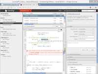
Coverity connect defect management console for NetSurfThe results are presented using the coverity connect web technology based defect management tool. Access to the coverity connect interface is controlled by a user management system which precludes publicly publishing the results within the CI system.

Unfortunately NetSurf itself does not currently have good enough JavaScript DOM bindings to support this interface so another browser must be used to view it.

Despite the drawbacks the quality of the analysis results is greatly superior to the clang solution. The false positive rate is very low while finding many real issues which had not been previously detected.

The analysis can be enhanced by use of collection configuration and modelling files which remove intended constructions from consideration reducing the false positive rate to very low levels. The ability to easily and persistently suppress false positives through the web interface is also available.

The false positive management capabilities coupled with a user interface that makes understanding the defect path simple make this solution very practical and indeed the NetSurf developers have removed over 50 actual issues within a relatively short period since the introduction of the tool.

Not all of those defects could be considered serious but they had the effect of encouraging deeper inspection of some very dubious smelling source.

Conclusions

The principle conclusions of implementing and using static analysis have been:

  • It is a powerful tool which aids programmers in improving their software. 
  • It is not a panacea and bad code can have no defects.
  • It can suggest possible defects early in the development cycle.
  • It can highlight possibly problematic areas well before they affect a programs users.
  • The tool and the infrastructure around it have a large impact on the usefulness of the results.
  • The way results are presented has disproportionately significant impact on the usability of the defect reports.
  • The open source tools are good, and improving, but coverity currently provides a superior experience.
  • Integration into a projects CI system is beneficial.
When I started looking at this technology I was somewhat dubious about its usefulness but I have definitely changed my mind. It is a useful addition to any non-trivial project and the return on time and effort should be repaid handsomely in all but already perfect code (if you believe you have such code I have a bridge to sell you).

Saturday, 5 October 2013

If I have a style, I am not aware of it.

I wish I had known about that quote from Michael Graves before now. I would have perhaps had an answer to some recent visitors to makespace.

There are regular scheduled visits to makespace where people can come and view our facilities, and perhaps start the process of becoming a member if they decide they like what they see.

Varnishing a folding chair using a stool as a stand
However, we sometimes get people who just turn up at the door. If a member feels charitable they may choose to give a short tour rather than just turn the person away. I happened to be in one Friday afternoon recently varnishing a folding chair when two such people rang the doorbell. There were few other members about and because watching varnish dry was dull I decided to be helpful and do a quick tour.

I explained that they really ought to return for a scheduled event for a proper tour, gave the obligatory minimal safety briefing, and showed them the workshops and tools. During the tour it was mentioned they were attending a certain local higher education establishment and were interested in makespace as an inexpensive studio.

Before they left I was asked what I was working on. I explained that I had been creating stools and chairs from plywood. At this point the conversation took a somewhat surreal turn, one of them asked, well more demanded, who my principle influence had been in designing with plywood.

When I said that I had mainly worked from a couple of Google image searches they were aghast and became quite belligerent.  They both insisted I must have done proper research and my work was obviously influenced by Charles and Ray Eames and Arne Jacobsen and surely I intended to cite my influences in my design documents.

My admission that I had never even heard the names before and had no design documents seemed to lead to a distinctly condescending tone as they explained that all modern plywood design stemmed from a small number of early 20th century designers and any competent designers research would have revealed that.

At this point in proceedings I was becoming a bit put out that my good deed of showing off the workshop had not gone unpunished. I politely explained that I designed simply by generating a requirement in my head, maybe an internet search to see what others had done, measuring real things to get dimensions and then a great deal of trial and error.

I was then abruptly informed that my "design process was completely invalid and there were well established ways to design furniture correctly and therefore my entire design was invalid" and that I was wasting time and material. I thanked them for their opinion and showed them out, safe and well before anyone gets any ideas.

I put the whole incident out of my mind until I finished writing up the final folding chair post the other day. It struck me that perhaps I had been unknowingly influenced by these designers. It was certainly true I had generated ideas from the hundreds of images my searches had revealed.

I did some research and it turns out that from the 1930s to the 1950s there were a string of designers using plywood in novel ways from the butterfly stool by Sori Yanagi through formed curvy chairs by Alvar Aalto and eero saarinen.

While these designers produced some wonderfully iconic and contemporary furniture I think that after reviewing my initial notes that two more modern designers Christian Desile and Leo Salom probably influenced me more directly. Though I did not reference their designs beyond seeing the images along with hundreds of others, certainly nothing was directly copied.

And there in lies an often repeated observation: no one creates anything without being influenced by their environment. The entire creative process of several billion ape descendants (or Golgafrincham telephone sanitisers if you prefer) is based on the simple process of copying, combining and transforming what is around us.

Isaac Newton by Sir Godfrey Kneller [Public domain], via Wikimedia Commons
I must accept that certain individuals at points in history have introduced radical improvements in their field, people like Socrates Galileo Leonardo Newton Einstein. However, even these outstanding examples were enlightened enough to acknowledge those that came before. Newtons quotation "If I have seen further it is by standing on the shoulders of giants" pretty much sums it up.

In my case I am privileged enough to live in a time where my environment has grown to the size of the world thanks to the internet. My influences, and therefore what I create, is that much richer but at the same time it means that my influence on others is similarly diminished.

I have joined the maker community because I want to create. The act of creation teaches me new skills in a physical, practical way and additionally I get to exercise my mind using new techniques or sometimes things I had forgotten I already knew. I view this as an extension of my previous Open Source software work, adding a physical component to a previously purely mental pursuit.

But importantly I like that my creations might provide inspiration for someone else. To improve those chances in the wider world I force myself to follow a few basic rules:
Release
Possibly one of the hardest things for any project. I carefully avoided the word finish here because my experience leads me to the conclusion that I always want to improve my designs.

But it is important to get to a point in a project where you can say "that is good enough to share", this is more common in software but it really applies to any project.

Share
If your aim here is to improve your society with your contribution sharing your designs and information is important. I think there is nothing better than someone else taking one of your designs and using it and perhaps improving on it, remember that is what you probably did in one way or another better to make it less hard for that to happen.

Ensure your design files are appropriately licensed and they are readily accessible. I personally lean towards the more generally accessible open source licences like MIT but the decision is ultimately yours.

Licencing is important, especially in the current copyright happy society. I know it sounds dull and no one takes that seriously, right? Sorry, but yes they do and it is better for you to be clear from the start, especially if there is a software component to your project. Oh one personal plea, use an existing well known licence, the world simply does not need another one!

Write about it
The blog posts about the things I have made sometimes take almost as much time as the creation.  The clear recording on my thoughts in written and photographic form often gives me more inspiration for improvements or other projects.

If someone else gets pleasure from the telling then that can only be good. If you do not do this then your voice cannot be heard and you wasted an opportunity to motivate others.

Feedback
If you do manage to get feedback on your creation, read it. You may disagree or not be interested for the current project but the feedback process is important. In software this often manifests as bug reports, in more physical projects this often becomes forum or blog comments.

Just remember that you need a thick skin for this, the most vocal members of any society are the minority with inflammatory opinion, the silent majority are by definition absent but there is still useful feedback out there.

Create again
By this I simply mean that once you are satisfied yourself on a project move on to the next. This may sound a little obvious but once you have some creative momentum it is much easier to keep going project to project than in you leave time between.

Also do not have too many projects ongoing, by all means have a couple so you do not get stuck waiting for materials or workshop time but more than three and four and you will never be able to release any of them.
Those students were perhaps somewhat misguided in how they stated their opinions, but they are correct that in the world in which we find ourselves we are all influenced. Though contrary to received wisdom those influences are more likely to be from the internet and our peers in the global maker society than historical artists.

Friday, 20 September 2013

Man is fully responsible for his nature and his choices.

Well at least he should be according to Sartre though I am not entirely convinced the repercussions of my choice to manufacture another folding chair were entirely thought through.

After my most recent posting the urge to do "just one more iteration" became too great and I succumbed. I therefore present version 4 of my folding chair which corrects all the previously discovered issues.

The popliteal height (420mm) and buttock popliteal length (400mm) are both comfortable for a wide selection of people. The seat slopes a few degrees front to back and the back rest no longer comes further forward than the rear of the seat.

There is a small gap above where the seat folds in when flat but that is only an aesthetic issue when being stored.

Manufacture wise the design is simple to produce although I really will have to teach our CNC router how to use the round over bit to reduce the finishing steps as currently that takes longer than the CNC operation.

In future if I make more of these I will use this design and, once she is less annoyed at me for making another chair, I am going to consult with my wife on adding some cushioning material to the seat and backrest.

And of course that concludes my furniture making for a while...yeah, right!

there have been comments which have complained about my usage of space on sheets and suggested I waste too much material. That is probably true and in my own defence I have not been working with this machine for very long and am not quite used to what I can "get away with" yet.

Side X folding stool
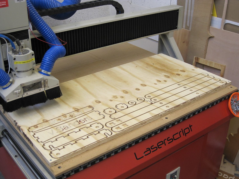
I was looking at the sheet after removing the last chair design and had a thought, I had not attempted a side X type folding design and perhaps I could squeeze one into the offcuts? I kinda got carried away, it roughly went:

  • Measure the available offcut space
  • Measured the remaining 18mm dowel leftover from my dowel hinge experiments
  • Found the largest width and height area I could get out of the sheet the CNC router ruined.
  • Sketched a design
  • Capture design to a DXF
  • Carefully spread the pieces over the available material in the CAM software
  • Generate a toolpath.
  • Cut material

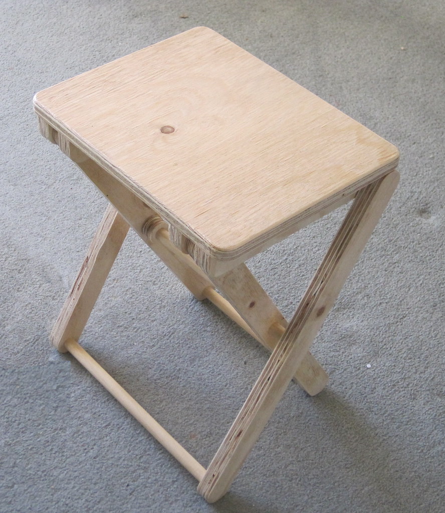
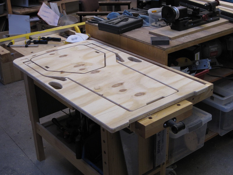
Side X folding stool cut from sheet offcut
If all of that sounds like and utterly mad way to design a size X stool, you are of course correct, but it worked, and it was a very fast process taking less than four hours from idea to stool.

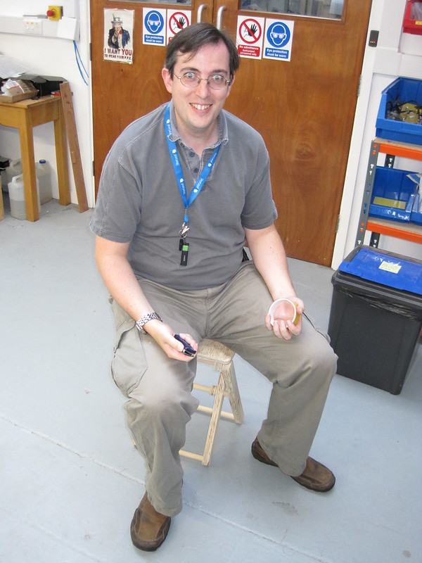
Paul testing the dry fit side X stool
There are a couple of issues:

  • the popliteal height is 470mm ( I was aiming at 420 and missed...badly)
  • It uses a lot of expensive hardwood dowel (1373mm plus cutting width and only way I could get it accurate was to use the disc sander to remove fractions till the length was correct)
  • I used pockets for the interference seat joints rather than through cuts and discovered that you need to allow tolerance depth (the pegs are 10mm deep and the sockets need to be at least 10.2 not the 10mm I cut)
  • Dowel joints are great but have a small surface area so friction fit joints work loose.
Clamping stool why the glue drys
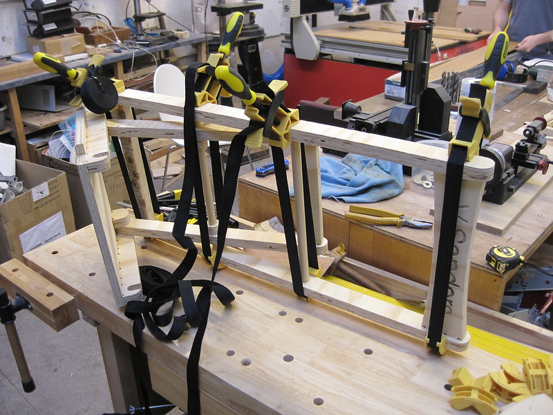
The seat went together dry fit and Paul tested it for me, however that last issue soon made me realise that this time I was going to have to resort to glue. Yes, sorry, this design needs to be glued to remain stable (I know plywood contains glue...please stop telling me that).


It is pretty simple to put together and aside from needing half the clamps in makespace to hold it in place while the glue dried, I had no trouble.

Though this is definitely not a case of use glue "sparingly" I put generous amounts in all the dowel joints and all the seat slots and got very little ooze so I guess it could have used more.

The final varnished stool is pretty robust but folds up nicely the concept of hooking to its own pivot dowel means it stays closed when flat which makes it very portable.

Total cost was an estimated £10.00 (£4.25 dowel, £2.50 of 24mm ply, £1.75 for 18mm ply, £0.50 tool wear, £1.00 varnish) though the materials in my case could be argued to have cost nothing.

It has been suggested that I could make an entire picnic table and chairs set this way but if I did I would reduce the stool height by 50mm and examine ways to use less dowel.

This is usually the bit where I point you all at the freely usable design files on github and all the photos on flikr and wrap up.

But you know what the Monty Python boys say? "Nobody Expects the Spanish inquisition"

Or in this case my final (and yes I am going to do something else next) chair design. It is based on the stool, in fact it is the stool design with the outer legs extended and a back rest added.

The modified design reduces the dowel requirements to 775mm but requires a bit more sheet material (cannot get this one entirely from offcuts).

Total cost was an estimated £10.50 (£2.50 dowel, £4.50 of 24mm ply, £1.75 for 18mm ply, £0.50 tool wear, £1.25 varnish).
Because it is based on the stool design it suffers from the height issue and in addition the back rest is a bit far back to be completely comfortable.

Neither of the side X designs have flaws that interest me enough to follow the iterative approach again to solve them. Both the designs work well enough and rounded out my adventures with folding chairs and indeed furniture for now.

As always the design files are on github and the images are on flikr.


Monday, 16 September 2013

Ever tried. Ever failed. No matter. Try Again. Fail again. Fail better.


I seem to be adhering to Beckett's approach recently but for some reason, after my previous stool attempts, despite having a functioning design I felt I had to do just one more iteration.

Five legged stoolGoing back to a previous concept of having five legs instead of three while this did not improve the rotational problems with the 12mm thick material, it did make the design more stable overall and less prone to tipping.

The five legged solution realised in 18mm plywood resulted in my final design for this concept. As my friend Stephen demonstrates the design is pretty solid even for those of us with a more ample frame. There are now a couple of them in use at the space alongside the three legged earlier versions.

I was finally satisfied with the result and thought I was done with furniture making for a while. My adorable wife then came up with a challenge, she wanted a practical foldable chair her requirements were:
  • Must be robust enough to cope with guests of all sizes
  • Use as little storage space as possible.
  • Not ugly.
  • Inexpensive enough they can be given as gifts.
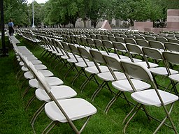
A frame folding chair, image from wikimedia
Things for individual humans to sit on raised off the floor, or chairs as we call them, have been around for a long time. My previous research for the stool indicated that chairs have a long history with examples still surviving from the ancient egyptians. From this I assumed there would be nothing novel in this project and to quote the song it's all been done before
Foldingchairs
Given this perspective my research started with an image search for "folding chair". The results immediately showed there were two common shapes. Either the chair base was formed with a pair of linked X shapes with the seat across the top, or an A frame style where the seat is across the centre.

My initial thoughts were to replicate the IKEA style A frame design until I noticed that some designs were made from a single sheet of timber with a small number of profile cuts. I searched for pre-existing design files but found none, perhaps I had found something novel to do after all.

A frame chair  1 - Front  2 - Rear  3- seat
Some quick measurements of chairs in shops (and more weird looks, mainly from my family) suggested 900mm is generally the highest a chair ought to stand. I selected a popliteal height of 420mm as a general use compromise which is a bit less than the 430mm of most mass produced chairs. I also decided there should be a front to rear drop across the seat which ought to improve comfort a little.

Material selection was based upon what I had to hand which consisted of a couple of sheets of structural plywood (1220x606x18mm temperate softwood - probably spruce although not specified) which had not become stools yet. Allowing for edge wastage and tool width this gave me a working area from a sheet of 1196x582mm.

I sketched the side view of the chair numbering the three parts. I decided part 1 would be 1000mm total height with top and bottom cross braces 80mm high, assuming the 900mm tall target, the A frame apex would be at 820mm height.

If we assert that the apex is immediately below the top cross brace on part 1 this gives 920mm at which point we have two sides of a right angled triangle (820 and 920) from which we can calculate the top angle is 26°. This also means part 2 will be 840mm long with the same 820 height this gives an angle of 10°.

I did the maths for the seat triangle using the 36° angle and 420mm popliteal height. Having experienced how flexible 18mm plywood was in the face dimension I decided to make the frame sides 50mm wide leaving, after 6mm tool path widths, enough space for a 358mm wide seat .

Once the dimensions were decided the design went pretty quickly producing something that looked similar to the designs I had seen earlier.

CNC routers can go wrong, spot the fail
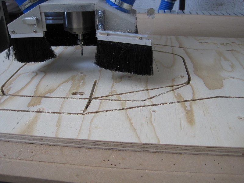
Generating toolpaths for this design proved challenging with the CAM software we had available, mainly because arranging multiple "inner" and "outer" cuts along the same path and having the tabs line up was obviously not an anticipated feature.

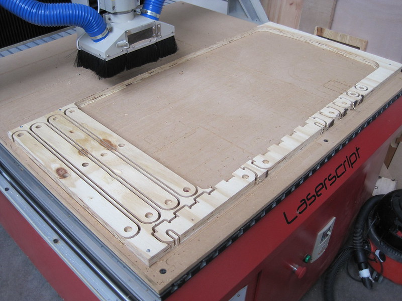
Things had been going far too well for me and during the routing operation our machine decided to follow an uncommanded toolpath excursion mid job (it cut a dirty great hole through the middle of my workpiece where I did not want it) ruining the sheet of material.

Fortunately, once factory reset and reconfigured, the machine ran the job correctly the second time although we still do not know why it went wrong. The parts were cut free of their tabs and hinges fitted.

The resulting design worked with a couple of problems:
  • I had made an error in my maths and added when I should have subtracted, as a result the seat slopes back to front which is not very comfortable. 
  • The chair feels very wide and tall.
  • The front face (part 1) flexes alarmingly between the seat and the ground when subjected to large loads.
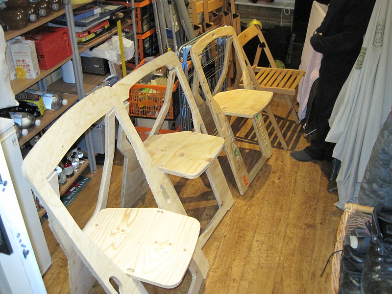
Folding chair in 24mm plywood with edges rounded off
So time for a second iteration, this time I selected a thicker plywood to reduce the bend under large loads (OK already, I mean me). After shopping around for several days I discovered that unlike 12mm and 18mm thick plywood 24mm thick is much harder to find at a sensible price especially if you want it cut into 1220x606 sheets from the full 1220x2440.

I eventually physically went to Ridgeons and looked at what they actually had in the warehouse and got a price on a sheet of brazilian elliotis pine structural plywood for £43.96 which they cut for me while I waited. Being physically present also gave me the opportunity to pick a "less bad" sheet from the stack much to the annoyance of the Ridgeons employee for not just taking the top one.

This time I reduced the apex height by 30mm, the length of part 1 by 80mm. I also reduced the frame width by 10mm relying on the increased thickness of the plywood to maintain the strength. In area terms it is actually an increase in material (50mm*17.7mm = 885 against 40mm*22.80 = 912). I also included rebates for the top hinges within the design allowing them to be mounted flush within the sheet width.

The new design was cut (without incident this time) and the edges rounded off. I also added some simple catches to keep the seat and back inline while being transported.

While this version worked I had made a couple of mistakes again. The first was simply a radius versus diameter error on the handles which meant too much material was removed from a high stress area causing increased bending.

Third version of folding chair ready for finishing
The second error was a stupid mistake that where I had worked the latch holes in the seat to the wrong side of my measure line meaning the apex angle was 35.5° not the expected 33.6 which meant the backrest felt "too far forward"

The third version rectified those two errors and improved the seat front curve a little to further reduce the unneeded material in the back rest.

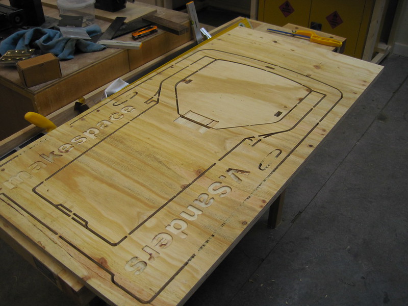
The fabrication of this design was double sided allowing for the seat hinge to be fully rebated and become flush and also adding some text similar to the stools.

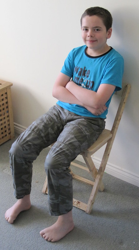
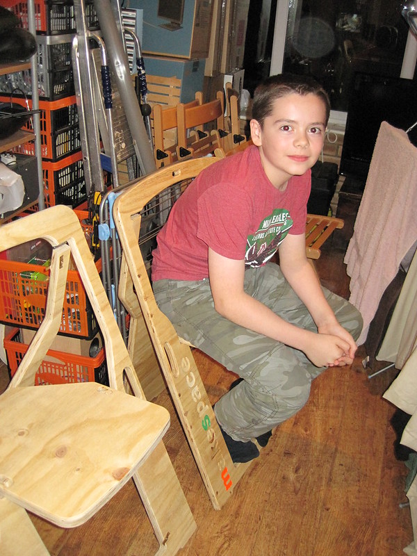
Alex sat on version 3 folding chair
This version still suffers from a backrest that is a bit too far forward and my sons complain it makes them sit up too straight. The problem is that the angle of the front face (23.6°) means that to move the rest back 20mm means the piece needs to extend another 50mm beyond the frame apex which would probably make the chair feel tall again.

I guess this is a compromise that would take another iteration or two to solve, alas my wife has declared a moratorium on more chairs unless I find somewhere to put the failed prototypes other than her conservatory.

One other addition would be a better form of catch for transport. The ones in version 2 work but are ugly, magnets inset into the frame have been suggested but not actually implemented yet.

Folding chairs versions 1 to 3 and TERJE for comparison
In conclusion I think I succeeded with the original brief and am pretty pleased with the result. A neatly folding chair that can be stacked simply by having a pile of them and are easy to move and setup.

The price per chair is a little higher than I would like at £22 (£11 for timber, £5 for hinges and screws , £5 for varnish and £1 for tool wear) plus about 2 hours labour (two sided routing plus roundover takes ages)

As previously the design files are available on github and there are plenty more images in the flikr set.

Thursday, 5 September 2013

Strive for continuous improvement, instead of perfection.


Kim Collins was perhaps thinking more about physical improvement but his advice holds well for software.

A lot has been written about the problems around software engineers wanting to rewrite a codebase because of "legacy" issues. Experience has taught me that refactoring is a generally better solution than rewriting because you always have something that works and can be released if necessary.

Although that observation applies to the whole of a project, sometimes the technical debt in component modules means they need reimplementing. Within NetSurf we have historically had problems when such a change was done because of the large number of supported platforms and configurations.

History

A year ago I implemented a Continuous Integration (CI) solution for NetSurf which, combined with our switch to GIT for revision control, has transformed our process. Making several important refactor and rewrites possible while being confident about the overall project stability.

I know it has been a year because the VPS hosting bill from Mythic turned up and we are still a very happy customer. We have taken the opportunity to extend the infrastructure to add additional build systems which is still within the NetSurf projects means.

Over the last twelve months the CI system has attempted over 100,000 builds including the projects libraries and browser. Each commit causes an attempt to build for eight platforms, in multiple configurations with multiple compilers. Because of this the response time to a commit is dependant on the slowest build slave (the mac mini OS X leopard system).

Currently this means a browser build, not including the support libraries, completes in around 450 seconds. The eleven support libraries range from 30 to 330 seconds each. This gives a reasonable response time for most operations. The worst case involves changing the core buildsystem which causes everything to be rebuilt from scratch taking some 40 minutes.

The CI system has gained capability since it was first set up, there are now jobs that:
  • Perform and publish the results of a static analysis for each component using the llvm/clang project scan-build tool.
  • Run coverage reports on modules which support gcov.
  • Build and install full toolchains for the cross compiled target platforms.
  • Run components automated tests on native platforms
  • Generate release sources and packages on a correctly tagged git commit.
  • Generates and publishes the automated Doxygen documentation.

Downsides

It has not all been positive though, the administration required to keep the builds running has been more than expected and it has highlighted just how costly supporting all our platforms is. When I say costly I do not just refer to the physical requirements of providing build slaves but more importantly the time required. 

Some examples include:
  • Procuring the hardware, installing the operating system and configuring the build environment for the OS X slaves
  • Getting the toolchain built and installed for cross compilation
  • Dealing with software upgrades and updates on the systems
  • Solving version issues with interacting parts, especially limiting is the lack of JAVA 1.6 on PPC OS X preventing jenkins updates
This administration is not interesting to me and consumes time which could otherwise be spent improving the browser. Though the benefits of having the system are considered by the development team to outweigh the disadvantages.

The highlighting of the costs of supporting so many platforms has lead us to reevaluate their future viability. Certainly the PPC mac os X port is in gravest danger of being imminently dropped and was only saved when the build slaves drive failed because there were actual users. 

There is also the question of the BeOS platform which we are currently unable to even build with the CI system at all as it cannot be targeted for cross compilation and cannot run a sufficiently complete JAVA implementation to run a jenkins slave.

An unexpected side effect of publishing every CI build has been that many non developer user are directly downloading and using these builds. In some cases we get messages to the mailing list about a specific build while the rest of the job is still ongoing.

Despite the prominent warning on the download area and clear explanation on the mailing lists we still get complaints and opinions about what we should be "allowing" in terms of stability and features with these builds. For anyone else considering allowing general access to CI builds I would recommend a very clear statement of intent and to have a policy prepared for when when users ignore the statement.

Tools

Using jenkins has also been a learning experience. It is generally great but there are some issues I have which, while not insurmountable, are troubling:
Configuration and history cannot easily be stored in a revision control system.
This means our system has to be restored from a backup in case of failure and I cannot simply redeploy it from scratch.

Job filtering, especially for matrix jobs with many combinations, is unnecessarily complicated.
This requires the use of a single text line "combination filter" which is a java expression limiting which combinations are built. An interface allowing the user to graphically select from a grid similar to the output tables showing success would be preferable. Such a tool could even generate the textural combination filter if thats easier.

This is especially problematic of the main browser job which has options for label (platform that can compile the build), javascript enablement, compiler and frontend (the windowing toolkit if you prefer e.g. linux label can build both gtk and framebuffer). The filter for this job is several kilobytes of text which due to the first issue has to be cut and pasted by hand.

Handling of simple makefile based projects is rudimentary.
This has been worked around mainly by creating shell scripts to perform the builds. These scripts are checked into the repositories so they are readily modified. Initially we had the text in each job but that quickly became unmanageable.

Output parsing is limited.
Fortunately several plugins are available which mitigate this issue but I cannot help feeling that they ought to be integrated by default.

Website output is not readily modifiable.
Instead of perhaps providing a default css file and all generated content using that styling someone with knowledge of JAVA must write a plugin to change any of the look and feel of the jenkins tool. I understand this helps all jenkins instances look like the same program but it means integrating jenkins into the rest of our projects web site is not straightforward.

Conclusion

In conclusion I think the CI system is an invaluable tool for almost any non trivial software project but the implementation costs with current tools should not be underestimated.

Wednesday, 28 August 2013

Men admire the man who can organize their wishes and thoughts in stone and wood and steel and brass.


I would probably not yet worthy of the admiration Emerson was alluding to but I do like to make things. As anyone who has read previous posts knows I have pretty much embraced the "do things, tell people" idea.

One small wrinkle is doing things needs somewhere to work. Since moving myself and the family to rented accommodation in Cambridge (swampy 3,500 year old English city, not the one in Massachusetts) I have been lacking space to do practical projects.

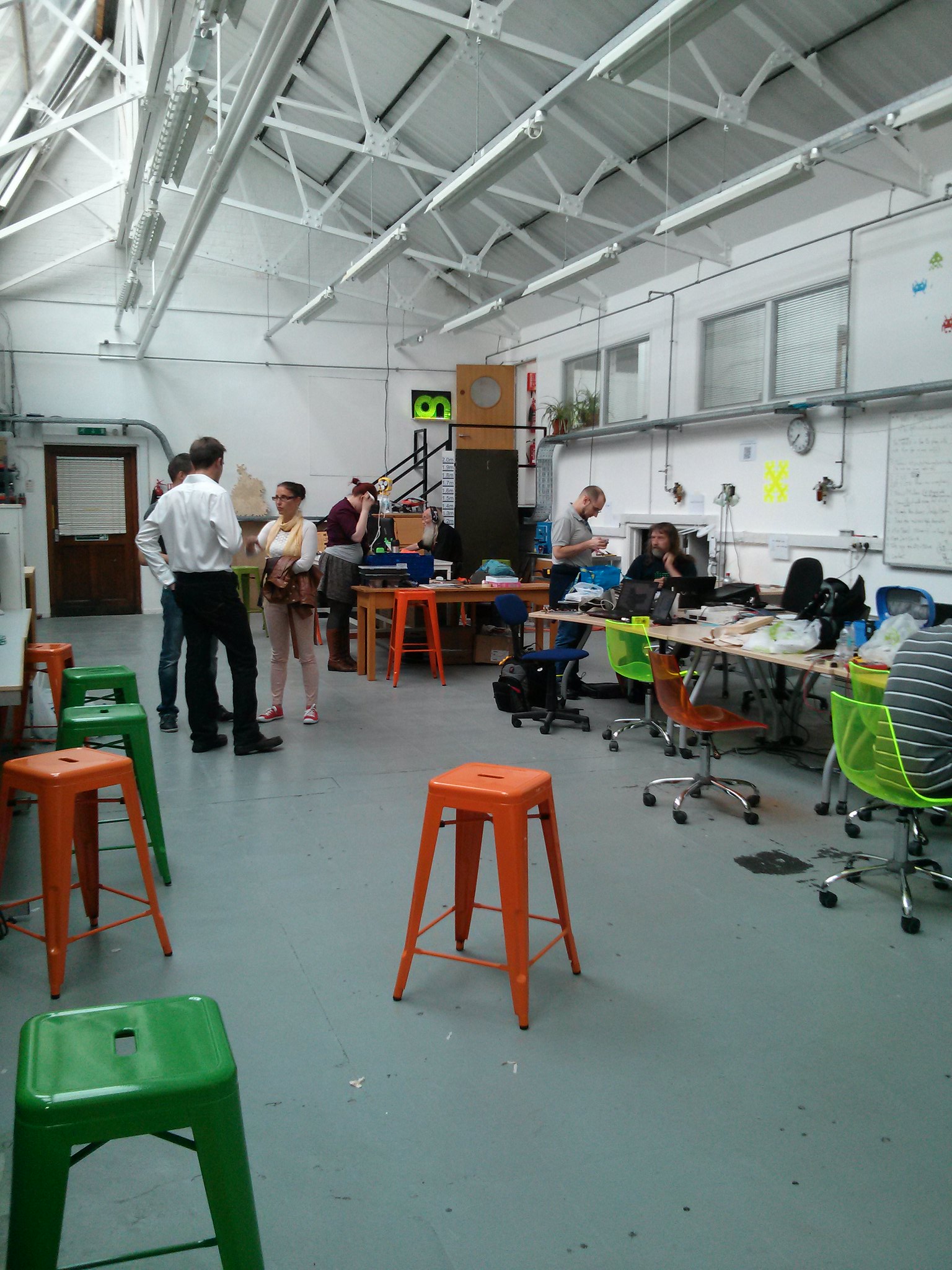
The main space
To fix this lack I have joined the cambridge makespace which, in addition to somewhere I can work gives me access to some tools I was previously unable to afford. The space gives practical training on the more complex machines (any tool can be dangerous if you do not use it correctly) which recently allowed my induction on the CNC router.

My instructor , Mark Mellors, who was good enough to give up some of his valuable making time to train me (and accidentally get his car stuck in a car park overnight by staying late) suggested that it was a good idea to have a design to try.

I decided to use this opportunity to actually create something useful (though now I re-read Marks message it did suggest a simple design...oopsy). I had been working at the electronics bench in previous weeks and been uncomfortable using the existing stools and chairs as they were either a bit high or unable to be adjusted high enough for the 80cm tall benches. I decided to design a 60cm tall stool for use at this workbench.

My initial idea was for a simple three leg stool, round top, three legs, how hard could it be? Initial research showed that showed that above 30cm the legs needed to be braced to each other. This is because the leg to seat joints simply cannot handle the stress caused by leverage which longer legs introduce.

I looked at the structure of several stools online and was initially drawn towards creating something like the IKEA Dalfred bar stool. It was discovered that the design would be easier to realise if it were made from sheet material which give a smaller challenge to a naive operator of a CNC router. Because of this simpler designs were researched and I eventually found a simple design I liked.

The design could not however be used directly as it was for imperial sized material which is not available in europe. I selected the QCAD open source CAD package and recaptured the design adjusting for the available 12mm plywood sheet material. This resulted in an imperial measurement design for metric materials.

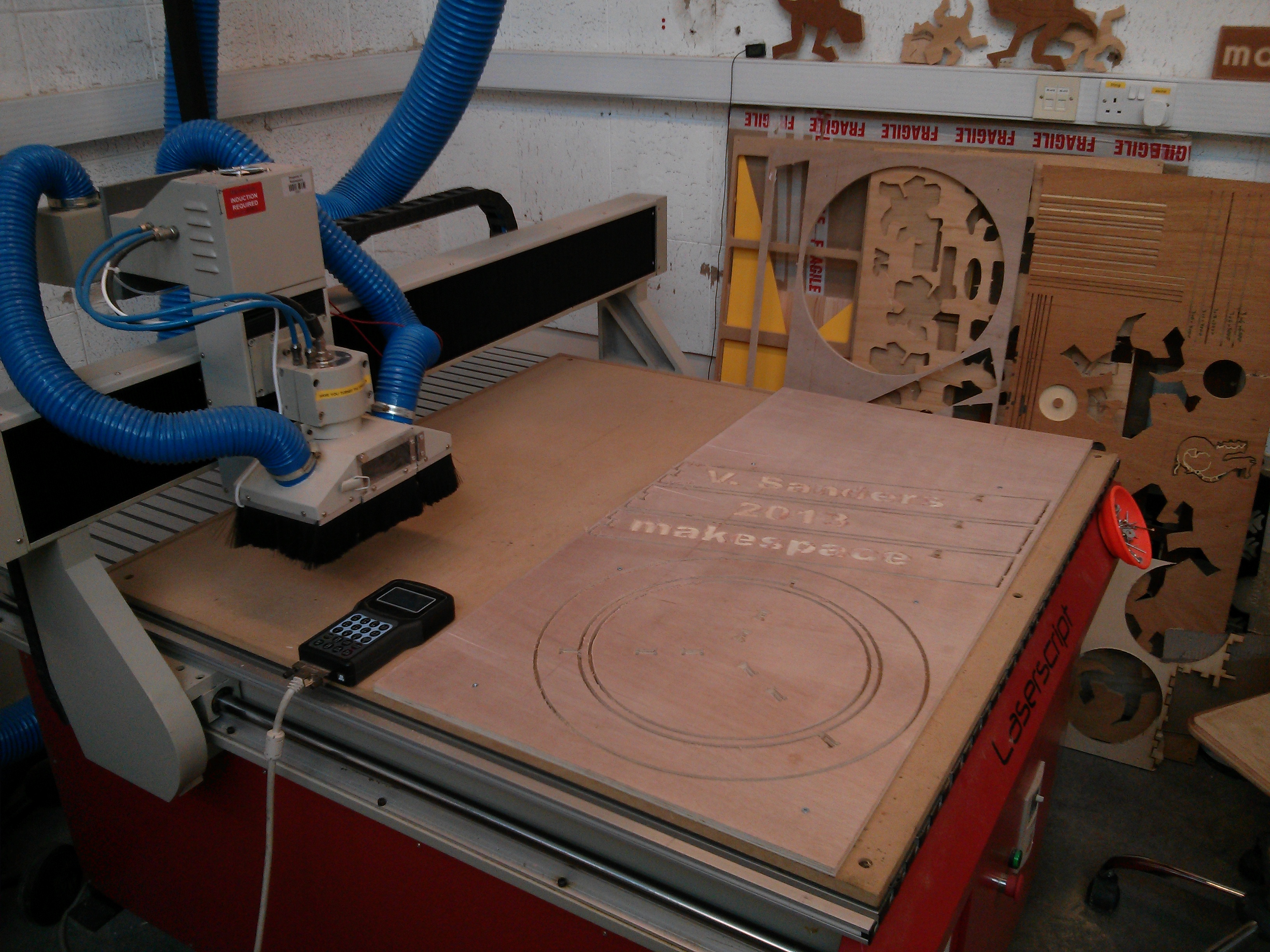
Mark helped me transfer the DXF into the CAM software (vcarve pro 7, after I discovered the demo version of this software generates files which cannot be imported into the full edition!) and generate toolpaths for our machine. Once the toolpaths are saved to a USB stick (no modern conveniences like direct upload here) the job can be run on the machine.

Here I ran into reality, turns out that tolerances in imperial combined with lack of understanding how plywood reacts resulted in excessive play in the joints. This resulted in an unusable stool, which simply tried to rotate around its central axis and become flatpack. I had successfully turned £10 worth of plywood into some sawdust and a selection of useless shapes. On the other hand I did become competent with the router workflow so it was not a complete failure.

I was determined to make the design work so I decided to start from scratch with a similar design but entirely in metric. I performed some material research both online and practically (why yes i did spend an informative hour in several cambridge DIY shops with digital calipers, why do you ask?)  it  turns out that generally available 12mm thick plywood actually ranges between 11.9 and 12mm thick.

I did some test slot cuts of varying width and determined that the available stock can be "persuaded" to fit into a 11.8mm wide slot. This Interference fit joint is strong and removes the need for adhesive in most cases.

Second cut still attached to the bed. Leftovers of first attempt in the background
The sheet plywood material is readily available with a width of 1220mm and a height of 606mm (a full sheet is 2440mm long which is cut into four with a 4mm wide saw blade) so making the legs fit within a sheet and be close to the 60cm target should be possible.

I selected a suitable seat radius (175mm) and from that determined the minimal gap to the base ring with a 6mm end mill tool (20mm for two toolpaths and some separation) and hence the minimum suitable width of the base ring (50mm) giving a total radius of 245mm.

For the legs allowance was made for two joints of 30mm with 30mm separation between them the legs come out at 90mm width. If a 6mm space and a 6mm toolpath top and bottom of the sheet is accounted for a 582mm height (606 - 24) is available in which to fit the legs. The top of the leg which fits into the seat is 12mm tall leaving 570mm total leg height.

12mm plywood stool design
At this point I selected some arbitrary values for the leg positioning and angle (30mm from seat centre and 15°) using a right angle triangle triganometry this produced a stool with a base of around 550mm or 100mm outside the radius of the seat. This seemed a pleasing shape and when the values for the holding ring were calculated it is at 104mm height which also seems to work out well.

This design was cut on the machine, lightly finished with some sandpaper and assembled. The legs slotted into the ring first and then the legs eased into the seat slots, the whole thing flipped and the seat hammered home onto the legs.

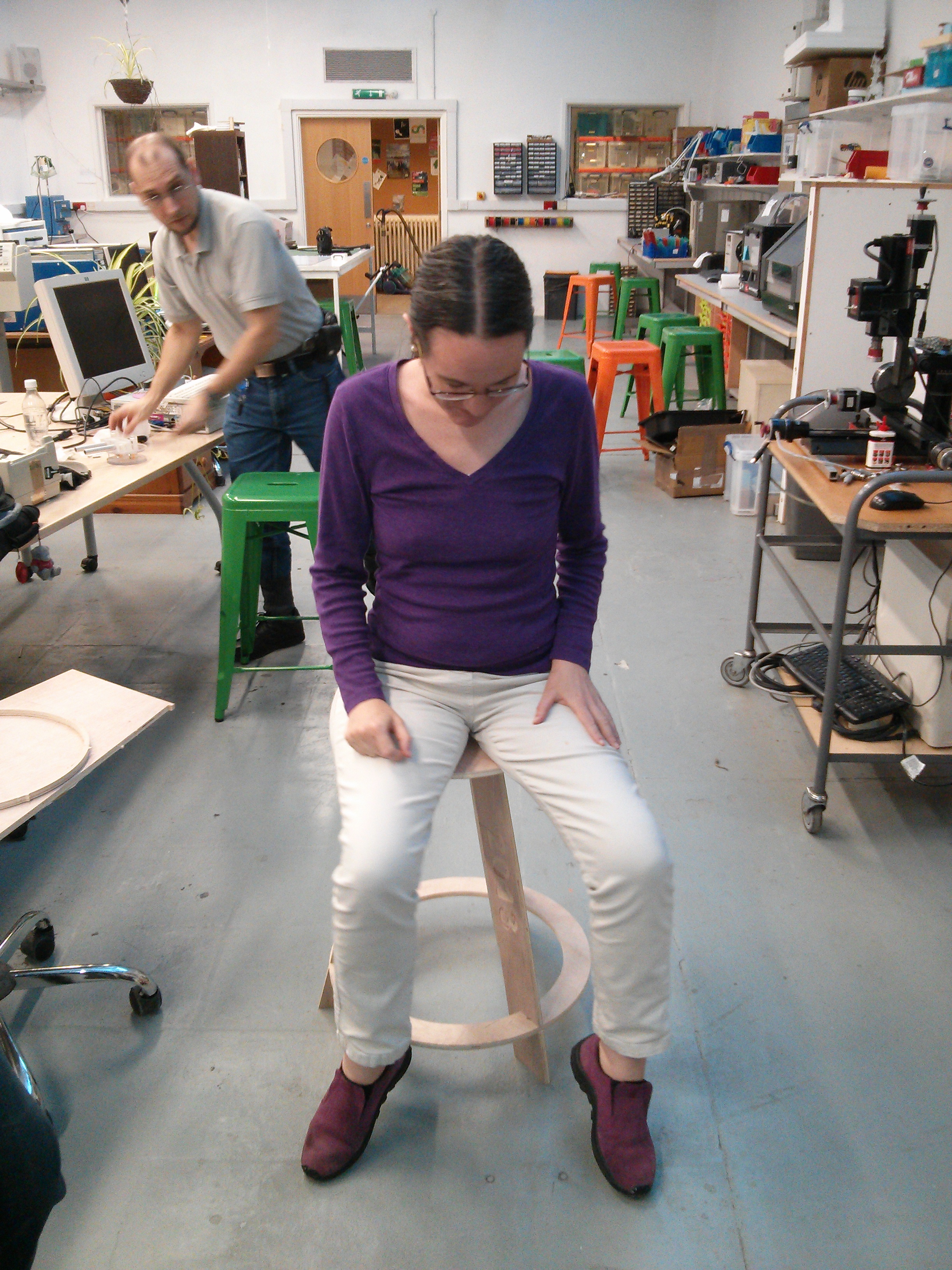
Anne Harrison volunteering to try the wobbly stool of doom
Success! It physically fit together and if you were brave enough you could sit on it. Unfortunately the plywood seemed to flex around the central axis of rotation in a rather alarming way, fine if you are under 70 kilos but not giving the impression of security most people want from their seating.

Ok, lets try with five legs instead of three (at least we can reuse the existing three legs)...nope still not good enough and another £10 gone.

18mm Plywood stool design
The others in the space suggested a few ideas to improve matters and the one I selected was to use 18mm plywood instead of 12mm, this should improve rigidity. There was a brief pause in proceedings to discover 18mm sheet is actually 17.7mm and needs a 17.5mm slot to make the interference fit work.

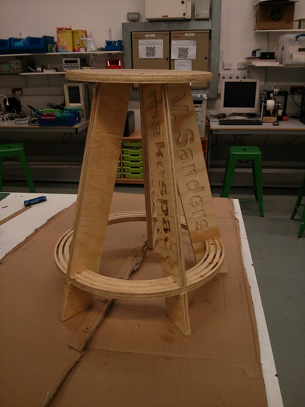
Completed 18mm stool
A swift redesign later altering the seat radius, gap, ring width and leg height to accommodate the new material and we have version 4 and it works without caveat. Tested up to 150Kg load without trouble, there is a small amount of flex still but nothing that feels worrying.

I finished the stool by rounding the seat top edge with a ball bearing rounding bit in a manual router and applying a couple of coats of gloss acrylic varnish. Finished stool is now doing service at the space.

In conclusion the final design allows someone with a CNC router to create a useful 580mm high fixed stool for £7.50 in timber plus cutter wear and varnish so maybe £8.50 total.

You can actually get five legs and a seat/ring out of a 1220x606 sheet and with intelligent arrangement a single 1220x2440 sheet will probably yield five or possibly six stools in total

I am making the design files of the proven 18mm version available (heck they are all there...but you have been warned, none of the other solutions produce a satisfactory result) under the MIT licence so anyone can reproduce. More pretty pictures are also available.

Monday, 24 June 2013

A picture is worth a thousand words

When Sir Tim made a band the first image on the web back in 1992, I do not imagine for a moment he understood the full scope of what was to follow. I also do not imagine Marc Andreessen understood the technical debt he was about to introduce and that fateful day in 1993 when he proposed the img tag allowing inline images.

Many will argue of course that the old adage of my title may not apply to the web, where if it were true, every page view would be like reading a novel! and many of those novels would involve cats or one pixel tall  colour gradients.

Leaving aside the philosophical arguments for a moment it takes web browser author a great deal of effort to quickly and efficiently put those cat pictures in front of your eyeballs.

Navigating

Images are navigated by a user in a selection of ways, including:
    Molly the cat
  • Direct navigation to an image like this cat picture is the original way images were viewed i.e not inline and as a separate document not involving any html. Often this is now handled by constructing a generated web page within the browser with the image inline avoiding the need for explicit image content handling.
  • An inline img tag (ironically it really does take thousands of words to describe) which puts the image within the web page not requiring the user to navigate away from the document being displayed. These tags are processed as the Document Object Model (DOM) is constructed from the html source. When an img tag is encountered a fetch is scheduled for the object and when complete the DOM completion events happen and the rendered page is updated.
  • Imported by a CSS stylesheet.
  • inline element created by a script
Whatever the method, the resulting object is subject to the same caching operations as any content object within a browser. These caching and storage operations are not specific to images however images are one of the most resource intensive objects a browser must regularly deal with (though javascript and stylesheet sources are starting to rival it at times) because they are relatively large and numerous.

Pre render processing

When the image object fetch is completed the browser must process the image for rendering which is where this gets even more complicated. I shall use how this works in NetSurf as I know that browsers internals best, but operation is pretty similar in many browsers.

The content fetch will have performed basic content sniffing to determine the received objects mime type. This is necessary because a great number of servers are misconfigured and a disturbingly large number of images served as png are really jpegs etc. Indeed sometimes you even get files served which are not images!

Upon receipt of enough data to decode the image header, for the detected mime type, the images metadata is extracted. This metadata usually includes things like size and colour depth.

If the img tag in the original source document omitted the width or height of the image the entire document render may have to be reflowed at this point to allow the correct spacing. The reflow process is often unsightly and should be avoided. Additionally at this stage if the image is too large to handle or an unhandled format the object will be replaced with the "broken" image icon.

Often that will be everything that is done with the image, when I added "lazy" image conversion to NetSurf we performed extensive profiling and discovered well over 40% of images on visited pages are simply never viewed by the user but that small (100 pixel on a side) images were almost always displayed.

This odd distribution comes down to how images are used in modern web pages, they broadly fall into two categories of "decoration" and "content" for example all the background gradients and sidebar images etc. are generally small images used as decoration whereas the cat picture above is part of the "content". A user may not scroll down a page to see content but almost always gets to "view" the decoration.

Rendering

Created by Andrea R used under CC Attribution-NonCommercial-ShareAlike 2.0 licence
The exact browser heuristics used differ as to when the render operation is performed but they all have a similar job to perform. When i say render here this may be possibly as an "off screen" view if they are actually on another tab etc. Regardless the image data must be converted from the source data (a PNG, JPEG etc.) into a format suitable for the browsers display plotting routines.

The browser will create a render bitmap in whatever format the plotting routines require (for example the GTK plotters use a Cairo image surface) , use an image library to unpack the source image data (PNG) into the render bitmap (possibly performing transforms such as scaling and rotation) and then use that bitmap to update the pixels on screen.

The most common transform at render time is that of scaling, this can be problematic as not all image libraries have output scaling capabilities which results in having to decode the entire source image and then scaling from that bitmap.

This is especially egregious if the source image is large (perhaps a multi megabyte jpeg) but the width and height are set to produce a thumbnail. The effect is amplified if the user has set the image cache size limit to a small value like 8 Megabytes (yes some users do this apparently their machines have 32MB of RAM and they browse the web)

In addition the image may well require tiling (for background gradients) and quite complex transforms (including rotation) thanks to CSS 3. Add in that javascript can alter the css style and hence the transform and you can imagine quite how complex the renderers can become.

Caching

The keen reader might spot that repeated renderings of the source image (e.g. because window is scrolled or clipped) result in this computationally expensive operation also being repeated. We solve this by interposing a render image cache between the source data and the render bitmaps.

By keeping the data in the preferred format, image rendering performance can be greatly increased. It should be noted that this cache is completely distinct from the source object cache and relates only to the rendered images.

Originally NetSurf used to perform the render conversion for every image as it was received without exception, rather than at render time, resulting in a great deal of unnecessary processing and memory usage. This was originally done for simplicity and optimising for "decoration" images.

The rules for determining what gets cached and for how long are somewhat involved and the majority of the code within the current implementation NetSurf uses is metrics and statistic generation to produce better decisions.

There comes a time at which this cache is no longer sufficient and rendering performance becomes unacceptable. The NetSurf renderer errs on the side of reducing resource usage (clearing the cache) at the expense of increased render times. Other browsers make different compromises based on the expected resources of the user base.

Finally

Hopefully that gives a reasonable overview to the operations a browser performs just to put that cat picture in front of your eyeballs.

And maybe next time your browser is guzzling RAM to plot thousands of images you might have a bit more appreciation to exactly what it is up to.

Thursday, 16 May 2013

True art selects and paraphrases, but seldom gives a verbatim translation

In my professional life I am sometimes required to provide technical support to one of our salesmen. I find this an interesting change in pace though sometimes challenging.

Occasionally I fail to clearly convey the solution we are trying to sell because of my tendency to focus on detail the customer probably does not need to understand but I think is the interesting part of the problem.

Conversely sometimes the sales people gloss over important technology choices which have a deeper impact on the overall solution. I was recently in such a situation where as part of a larger project the subject of internationalisation (you can see why it gets abbreviated to i18n) was raised.

I had little direct personal experience with handling this within a project workflow so could not give any guidance but the salesman recommended the Transifex service as he had seen it used before, indicated integration was simple and we moved onto the next topic.

Unfortunately previous experience tells me that sometime in the near future someone is going to ask me hard technical questions about i18n and possibly how to integrate Transifex into their workflow (or at least give a good estimate on the work required).

Learning

Being an engineer I have few coping strategies available for situations when I do not know how something works. The approach I best know how to employ is to give myself a practical crash course and write up what I learned...so I did.

I proceeded to do all the usual things you do when approaching something unfamiliar (wikipedia, google, colleagues etc.) and got a basic understanding of internationalisation and localisation and how they fit together.

This enabled me to understand that the Transifex workflow proposed only covered the translation part of the problem and that, as Aldrich observed in my title quote, there is an awful lot more to translation than I suspected.

Platforms

My research indicated that there are numerous translation platforms available for both open source and commercial projects and Transifex is one of many solutions.

Although the specific platform used was Transifex most of these observations apply to all these other platforms. The main lesson though is that all platforms are special snowflakes and once a project invests effort and time into one platform it will result in the dreaded lock in. The effort to move to another platform afterwards is at least as great as the initial implementation.

It became apparent to me that all of these services, regardless of their type, boil down to a very simple data structure. They appear to be a trivial table of Key:Language:Value wrapped in a selection of tools to perform format conversions and interfaces to manipulate the data.

There may be facilities to attach additional metadata to the table such as groupings for specific sets of keys (often referred to as resources) or translator hints to provide context but the fundamental operation is common.

The pseudo workflow is:
  • Import a set of keys
  • Provide a resource grouping for the keys.
  • Import any existing translations for these keys.
  • Use the services platform to provide additional translations
  • Export the resources in the desired languages.
The first three steps are almost always performed together by the uploading of a resource file containing an initial set of translations in the "default" language and  due to the world being the way it is this is almost always english (some services are so poorly tested with other defaults they fail if this is not the case!)

The platforms I looked at generally follow this pattern with a greater or lesser degree of freedom in what the keys are, how the groupings into resources are made and the languages that can be used. The most common issue with these platforms (especially open source ones) is that the input convertors will only accept a very limited number of formats and often restricted to just GNU gettext PO files. This means that to use those platforms a project would have to be able to convert any internal resources into gettext translatable format. 

The prevalence of the PO format pushes assumptions into almost every platform I examined, mainly that a resource is for a single language translation and that the Key (msgid in gettext terms) is the untranslated default language string in the C locale.

The Transifex service does at least allow for the Key values to be arbitrary although the resources are separated by language.

Even assuming a project uses gettext PO files and UTF-8 character encoding (and please can we kill every other character encoding and move the whole world to UTF-8) the tools to integrate the import/export into the project must be written.

A project must decide some pretty important policies, including:
  • Will they use a single service to provide all their translations.
  • Will they allow updates to the files in their revision control system and how those will be integrated.
  • Will there be a verification step and if so who and how will that be performed. Especially important is the question of a reviewer understanding the translated language being integrated and how that is controlled.
  • Will the project be paying for translations
  • Will the project allow machine translations, if not can they be used as an initial hint (sometimes useful if the translators are weak in the "default" language
These are project policy decisions and, as I discovered, just as difficult to answer as the technical challenges.

Armed with my basic understanding it was time to move on and see how the transifex platform could be integrated into a real project workflow.

Implementing

Proof of concept

My first exercise was to take a trivial command line tool, use xgettext to generate a PO file and add the relevant libintl calls to produce gettext internationalised tool.

A transifex project was created and the english po file uploaded as the initial resource. A french language was added and the online editor used to provide translations for some strings. The PO resource file for french was exported and the tool executed with LANGUAGE=fr and the french translation seen.

This proved the trivial workflow was straightforward to implement. It also provided insight into the need to automate the process as the manual website operation would soon become exceptionally tedious and error prone.

Something more useful

To get a better understanding of a real world workflow I needed a project that:
  • Already internationalised but had limited language localisation 
  • Did not directly use gettext 
  • Had a code base I understood
  • Could be modified reasonably easily.
  • Might find the result useful rather than it being a purely academic exercise.
I selected the NetSurf web browser as it best fit this list.

Internally NetSurf keeps all the translated messages in a simple associative array this is serialised to an equally straightforward file named FatMessages. The file is UTF-8 encoded with keys separated from values by a colon. The Key is constrained to be ASCII characters with no colons and is structured as language.toolkit.identifier and is unique on identifier part alone.

This file is processed at build time into a simple identifier:value dictionary for each language and toolkit.

Transifex can import several resource formats similar to this, after experimenting with YAML and Android Resource format I immediately discovered a problem, the services import and export routines were somewhat buggy.

These routines coped ok with simple use cases but having more complex characters such as angle brackets and quotation marks in the translated strings would completely defeat the escaping mechanisms employed by both these formats (through entity escaping in android resource format XML is problematic anyway)

Finally the Java property file format was used (with UTF-8 encoding) which while having bugs in the import and export escaping these could at least be worked around. The existing tool that was used to process the FatMessages file was rewritten to cope with generating different output formats and a second tool to merge the java property format resources.

To create these two tools I enlisted the assistance of my colleague Vivek Dasmohapatra as his Perl language skills exceeded my own. He eventually managed to overcome the format translation issues and produce correct input and output.

I used the Transifex platforms free open source product, created a new project and configured it for free machine translation from the Microsoft service, all of which is pretty clearly documented by Transifex.

Once this was done the messages file was split up tinto resources for the supported languages and uploaded to the transifex system.

I manually marked all the uploaded translations as "verified" and then added a few machine translations to a couple of languages. I also created spanish as a new language and machine translated most of the keys.

The resources for each language were then downloaded and merged and the resulting FatMessages file checked for differences and verified only the changes I expected appeared.

I quickly determined that manually downloading the language resources every time was not going to work with any form of automation, so I wrote a perl script to retrieve the resources automatically (might be useful for other projects too).

Once these tools were written and integrated into the build system I could finally make an evaluation as to how successful this exercise had been.

Conclusions

The main things I learned from this investigation were:

  • Internationalisation has a number of complex areas
  • Localisation to a specific locale is more than a mechanical process.
  • The majority of platforms and services are oriented around textural language translation
  • There is a concentration on the gettext mode of operation in many platforms
  • Integration to any of these platforms requires both workflow and technical changes.
  • At best tools to integrate existing resources into the selected platform need to be created
  • Many project will require format conversion tools, necessitating additional developer time to create.
  • The social issues within an open source project may require compromise on the workflow.
  • The external platform may offer little benefits beyond a pretty user interface.
  • External platforms introduce an external dependency unless the project is prepared and able to run its own platform instance.
  • Real people are still required to do the translations and verify them.
Overall I think the final observation has to be that integrating translation services is not a straightforward operation and each project has unique challenges and requirements which reduce the existing platforms to compromise solutions.